how I went from this…

to this.
I loved designing this logo.
Game Breakers Sport Cards is a retail store located in Ottawa, specializing in all things sports cards, non-sport cards, and gaming cards. Sealed products, singles, supplies, and collectibles - they've got them all!
The client approached me with a pretty clear idea of what they were looking for. As all designers know… that can be a gift and a curse.
The Game Breakers team had a vision of a “fireball”, as they put it, shooting through their initials; GB. That said, they also wanted to see a couple alternatives.
Being located in the nation’s capital, they were looking to have their colour scheme the classic Ottawa sports team colours; red, black and white. I grew up and currently live in Ottawa, so I had a ton of inspiration.
So for the first draft, I submitted four options to start at…
Draft 1
Stacked.
Resembling stacked cards, I wanted to go for a TSN-like look. That is where the frame came from. I was happy with the addition of a “play” button in the B, as well.
Movement.
This was an interesting one. Some days I love it, and others I hated it. The red “cards” on either end with the motion in the GB between them was suppose to visualize trading or playing.
Connected.
Simple but effective. Connecting the top creates the shape of a card, and portrays connection. Although… it does have a tire brand feel.
Fireball.
The fireball was alive and well. Even though it didn’t make the final version, I took the streak and tried to incorporate a card. I thought the framed look was a cool way to make the GB stand out.
the feedback.
Generally, they were pretty happy. After a brief discussion, we confirmed we were on the same page about the direction - We had a winner!
After consulting with some regular customers, the team decided to move forward with the fireball option. Their original vision was strong enough to continue perusing. I did have a couple ideas to add to really make this design stand out.
Draft 2
Evolution.
The connection of the G and B was to bring the piece together, to make it feel like one complete symbol. I also extended the streak’s tail to be parallel with the frame to add some dynamicity. I got a Cleveland Cavaliers feel from it.
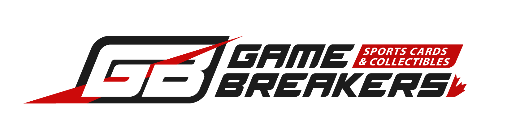
final


Supporting

Happy Anniversary!
As I celebrated my 30th birthday this year, I realized this was also Game Breaker’s milestone year. So I created this using the typography outlines I had created for the brand.
See the brand in action at GameBreakers.ca